The SQL dashboard widget lets you create custom dashboards using data from your MySQL and Microsoft SQL databases.
How It Works
Step 1. Configure a new custom SQL widget inside your dashboard and add your database account to it by clicking the Add Account button.
Step 2. Select the type of chart you want to use with your widget (e.g. line, area, table) and a refresh rate to specify how often you want us to fetch new data (e.g. every 5 mins).
Step 3. Enter the SQL query you want to use with your widget and click the Save Widget button. Make sure your query’s resulting data format matches the format of the chart type you selected in step 2 (see below for data format examples).
SQL Examples
Let’s walk through a few examples to get you started. We’ll use this database table named “users” as a basis for our SQL queries and the MySQL syntax. You can adapt these examples to fit your specific use cases as needed.
| uid | full_name | gender | revenue | registered |
| 1001 | John Doe | Male | 372.29 | 2017-01-13 10:21:47 |
| 1002 | Adrian Miller | Female | 473.48 | 2017-01-15 23:34:53 |
| 1003 | Tim Taylor | Male | 952.78 | 2017-01-16 07:56:29 |
| 1004 | Bill Simpson | Male | 173.40 | 2017-01-16 16:42:41 |
| 1005 | Mona Junior | Female | 821.64 | 2017-01-20 03:20:12 |
Note: The best way to troubleshoot your SQL queries is by using our “Table” chart type. This will allow you to easily see the resulting data format for your query before applying it to a graph (e.g. line, area, gauge).
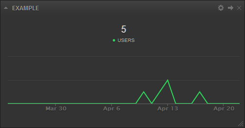
Example 1: Line Chart
This example shows you how to write a SQL query that displays the number of registered users in our database table over time in a line chart. We’re going to use “Date” as the first header label to take advantage of the historical data feature in your dashboard (i.e. this will allow you to change time periods using your dashboard date picker).
| SELECT DATE_FORMAT(`registered`, “%Y%m%d”) AS `Date`, COUNT(*) AS `Users` FROM `users` GROUP BY `Date` |
| Date | Users |
| 20170113 | 1 |
| 20170115 | 1 |
| 20170116 | 2 |
| 20170120 | 1 |
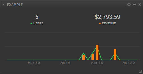
Example 2: Line + Column Charts
This example shows you how to write a SQL query that displays two metrics in a single widget, the number of registered users in a line chart and the amount of revenue generated in a column chart over time. To do this we’ll append the optional “Type” parameter to the end of our query using the UNION syntax. Additionally, we’ll specify that the revenue metric is currency based by appending “($)” to the end of the revenue header label.
| SELECT DATE_FORMAT(`registered`, “%Y%m%d”) AS `Date`, COUNT(*) AS `Users`, SUM(`revenue`) AS `Revenue($)` FROM `users` GROUP BY `Date` UNION SELECT ‘Type’, ‘line’, ‘column’ |
| Date | Users | Revenue($) |
| 20170113 | 1 | 372.29 |
| 20170115 | 1 | 473.48 |
| 20170116 | 2 | 1126.18 |
| 20170120 | 1 | 821.64 |
| Type | line | column |
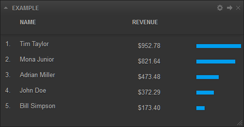
Example 3: List Chart
This example shows you how to write a SQL query that displays a leaderboard of top users by amount of revenue generated. We’ll append the optional “Color” parameter to the end of our query using the UNION syntax along with a hexadecimal color code to use with our chart (this replaces the default color the widget would normally use).
| SELECT * FROM (SELECT `full_name` AS `Name`, `revenue` AS `Revenue($)` FROM `users` ORDER BY `revenue` DESC) as `tb1` UNION SELECT ‘Color’, ‘#009dee’ |
| Name | Revenue($) |
| Tim Taylor | 952.78 |
| Mona Junior | 821.64 |
| Adrian Miller | 473.48 |
| John Doe | 372.29 |
| Bill Simpson | 173.40 |
| Color | #009dee |
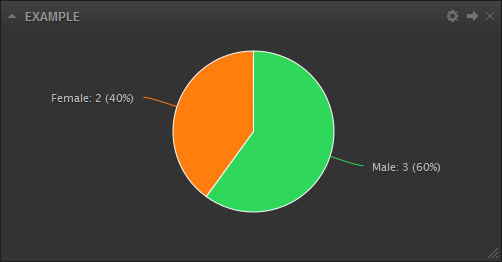
Example 4: Pie Chart
This example shows you how to write a SQL query that displays the total number of males and females in our database table in a pie chart.
| SELECT (SELECT COUNT(*) FROM `users` WHERE `gender`=’Male’) AS ‘Male’, (SELECT COUNT(*) FROM `users` WHERE `gender`=’Female’) AS ‘Female’ |
| Male | Female |
| 3 | 2 |
Example 5: Gauge Chart
This example shows you how to write a SQL query that displays the total revenue generated against a target value in a gauge chart. We’ll also take advantage of a special feature called “Merge Tags” by adding the {date_start} and {date_end} merge tags directly to our query. These tags will be automatically replaced by the respective dates in YYYYMMDD format when your query is executed based on the selected time period in your dashboard (i.e. the data automatically updates when you change time periods using your dashboard date picker).
| SELECT SUM(`revenue`) as `Revenue($)`, ‘5000.00’ as `Target` FROM `users` WHERE `registered`>='{date_start}’ AND `registered`<‘{date_end}’ |
| Revenue($) | Target |
| 2793.59 | 5000.00 |
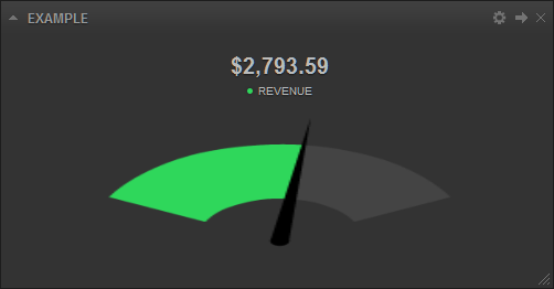
Chart Types
As of today, the following chart types are available for you to use.
Line, Spline, Area, Area-Spline, Stacked Area, Column, Stacked Column, Stacked Percentage Column, Bar, Stacked Bar
These charts are used to show trends and performance over a period of time.
Data Format
You can group as many metrics together as you like into a single widget.
Labels: Required. In the first row of your data, you must specify what labels you would like to use for your metrics. You can also specify the type of value your labels will represent (i.e. dollar amount, percentage, time) by appending “($)”, “(%)”, or “(:)” at the end of the label. The first value in this row must always be “Date” if you would like to take advantage of historical data features like data archival and date range selections.
Data: Required. Starting from the second row, append a list of values for your metrics starting with the date (YYYYMMDD) as the first value in each row.
Colors: Optional. You can use your own color scheme for your metrics by appending a row of hexadecimal color codes to the end of your list. The first value in this row must always be “Color”.
Types: Optional. You can specify the type of chart you want to see for each individual metric by appending a row of chart types to the end of your list. The first value in this row must always be “Type”. By default all metrics will use the chart type selected in the widget configuration screen.
Cumulative: Optional. Use this row to indicate whether you would like to see cumulate values for particlar metrics in the widget header. The first value in this row must always be “Cumulative”. Use the values “0” or “1” to indicate which metric to cumulate values for (e.g. “Cumulative,1,0,0,0”).
Average: Optional. Use this row to indicate whether to display averages for particular metrics in the widget header. The first value in this row must always be “Average”. Use the values “0” or “1” to indicate which metric to average (e.g. “Average,1,0,0,0”).
Total: Optional. If you use “Date” as the first column label in your data, by default the widget will automatically calculate the averages for percentage based metrics or the sums for all other metrics based on the current time period and display them in the widget header. This row enables you to overwrite these values in the widget header. The first value in this row must always be “Total” (e.g. “Total,542,23,42,49”).
Comparison: Optional. If you use “Date” as the first column label in your data, by default the widget will automatically calculate percent changes for each metric by comparing the current time period against the last based on the current time period and display it in the widget header. This row enables you to overwrite these values in the widget header. The first value in this row must always be “Comparison” (e.g. “Comparison,-10,50,42,0”).
Reverse: Optional. Use this row to indicate whether high values are good or bad for particlar metrics (e.g. high “unlikes” count on Facebook is bad). This row is used to caclulate percent differences (comparisons) in the widget header. The first value in this row must always be “Reverse”. Use the values “0” or “1” to indicate which metric to reverse (e.g. “Reverse,1,0,0,0”).
ReverseGraph: Optional. Use this row to indicate whether you want to display a graph upside down (e.g. when displaying ranking information). The first value in this row must always be “ReverseGraph”. Use the values “0” or “1” to indicate which metric to reverse the graph for (e.g. “ReverseGraph,1,0,0,0”).
YAxis: Optional. By default each metric you add to the widget falls on its own y-axis. This row enables you to use a single y-axis across all your metrics in the widget thereby syncing the data. The first value in this row must always be “YAxis”. Use the value “0” for all metrics to sync them (e.g. “YAxis,0,0,0,0”).
YAxisMin: Optional. The minimum value of the y-axis. By default this value is “0” for each metric. The first value in this row must always be “YAxisMin” (e.g. “YAxisMin,0,20,100,0”).
YAxisMax: Optional. The maximum value of the y-axis. By default this value is automatically calculated for each metric. The first value in this row must always be “YAxisMax” (e.g. “YAxisMax,1000,2000,500,600”).
YAxisShow: Optional. By default all y-axes are hidden. This row enables you to turn on the y-axis for a particlar metric. The first value in this row must always be “YAxisShow”. Use the values “0” or “1” to indicate which metric’s y-axis to show (e.g. “YAxisShow,1,0,0,0”).
LabelShow: Optional. By default all data labels are hidden. This row enables you to turn on the data labels for a particlar metric. The first value in this row must always be “LabelShow”. Use the values “0” or “1” to indicate which metric’s data labels to show (e.g. “LabelShow,1,0,0,0”).
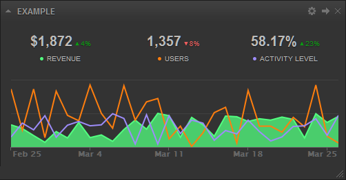
Example
| Date | Revenue($) | Users | Activity Level(%) |
| 20170117 | 29 | 82 | 10 |
| 20170118 | 87 | 38 | 82 |
| 20170119 | 30 | 63 | 48 |
| 20170120 | 70 | 65 | 41 |
| 20170121 | 12 | 52 | 14 |
| 20170122 | 78 | 41 | 36 |
| 20170123 | 10 | 23 | 51 |
| 20170124 | 71 | 24 | 86 |
| Color | #52ff7f | #ff7e0e | #9d8cf9 |
| Type | area | line | line |
Pie, Donut
These charts are used to show the breakdown of data into its constituents, i.e. parts of a whole.
Data Format
Each row is a comma separated list of values. You can only display 1 metric in a single widget.
Labels: Required. In the first row of your data, you must specify what labels you would like to use for your metrics. You can also specify the type of value your labels will represent (i.e. dollar amount, percentage, time) by appending “($)”, “(%)”, or “(:)” at the end of the label.
Data: Required. In the second row, append a list of values for your metric.
Colors: Optional. You can use your own color scheme for your metric values by appending a row of hexadecimal color codes to the end of your list. The first value in this row must always be “Color”.
Example
| Plan 1 | Plan 2 | Plan 3 |
| 13 | 53 | 34 |
| Color,#ff7f00 | #00cb13 | #ee0000 |

List
This chart is used to display information in list format.
Data Format
Each row is a comma separated list of values. You can only display 1 metric in a single widget.
Labels: Required. In the first row of your data, you must specify what labels you would like to use for your metrics. You can also specify the type of value your labels will represent (i.e. dollar amount, percentage, time) by appending “($)”, “(%)”, or “(:)” at the end of the label.
Data: Required. Starting from the second row, append a list of values for your metric.
Colors: Optional. You can use your own color scheme for your metric values by appending a row of hexadecimal color codes to the end of your list. The first value in this row must always be “Color”.
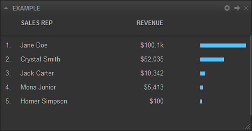
Example
| Sales Rep | Revenue($) |
| Jane Doe | 100132 |
| Crystal Smith | 52035 |
| Jack Carter | 10342 |
| Mona Junior | 5413 |
| Homer Simpson | 100 |
| Color | #ff7f00 |
Funnel
This chart is used to display information in a funnel.
Data Format
Each row is a comma separated list of values. You can only display 1 metric in a single widget.
Labels: Required. In the first row of your data, you must specify what labels you would like to use for your metrics. You can also specify the type of value your labels will represent (i.e. dollar amount, percentage, time) by appending “($)”, “(%)”, or “(:)” at the end of the label.
Data: Required. Starting from the second row, append a list of values for your metric.
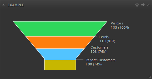
Example
| Type | Count |
| Visitors | 135 |
| Leads | 110 |
| Customers | 103 |
| Repeat Customers | 100 |
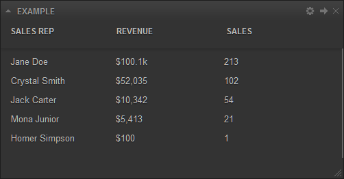
Table
This chart is used to display information in table format.
Data Format
Each row is a comma separated list of values. You can group as many metrics together as you like into a single widget.
Labels: Required. In the first row of your data, you must specify what labels you would like to use for your metrics. You can also specify the type of value your labels will represent (i.e. dollar amount, percentage, time) by appending “($)”, “(%)”, or “(:)” at the end of the label.
Data: Required. Starting from the second row, append a list of values for your metric.
Example
| Sales Rep | Revenue($) | Sales |
| Jane Doe | 100132 | 213 |
| Crystal Smith | 52035 | 102 |
| Jack Carter | 10342 | 54 |
| Mona Junior | 5413 | 21 |
| Homer Simpson | 100 | 1 |
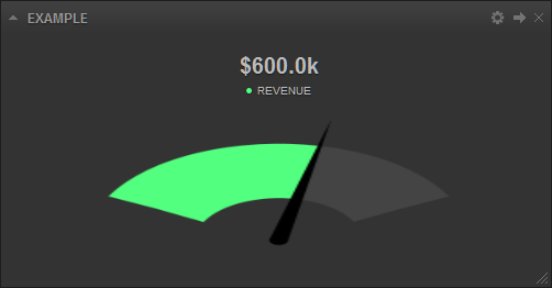
Gauge
This chart is used to display information in a gauge.
Data Format
Each row is a comma separated list of values. You can only display 1 metric in a single widget.
Labels: Required. In the first row of your data, you must specify what label you would like to use for your metric. You can also specify the type of value your label will represent (i.e. dollar amount, percentage, time) by appending “($)”, “(%)”, or “(:)” at the end of the label.
Data: Required. In the second row, append the current and target values for your metric.
Colors: Optional. You can use your own color scheme for your metric by appending a hexadecimal color code to the end of your list. The first value in this row must always be “Color”.
LabelShow: Optional. By default the target data label is hidden. This row enables you to turn it on for your metric. The first value in this row must always be “LabelShow”. Use the values “0” or “1” to indicate whether to show the target data label (e.g. “LabelShow,1”).
Example
| Revenue($) | Target |
| 600000 | 1000000 |
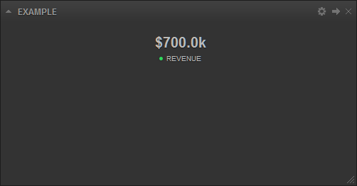
Number
This chart is used to display information as a simple number.
Data Format
Each row is a comma separated list of values. You can group as many metrics together as you like into a single widget.
Labels: Required. In the first row of your data, you must specify what label you would like to use for your metric. You can also specify the type of value your label will represent (i.e. dollar amount, percentage, time) by appending “($)”, “(%)”, or “(:)” at the end of the label.
Data: Required. In the second row, append the value you want to display for your metric.
Colors: Optional. You can use your own color scheme for your metric by appending a hexadecimal color code to the end of your list. The first value in this row must always be “Color”.
Example
| Revenue($) |
| 700000 |
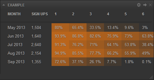
Cohort
This chart is used to display behaviors of a group of subjects over a time span (e.g. customer retention rates).
Data Format
Each row is a comma separated list of values. You can only display 1 metric in a single widget.
Labels: Required. In the first row of your data, you must specify what labels you would like to use for your metric.
Data: Required. Starting from the second row, append a list of values for your metric.
Colors: Optional. You can use your own color scheme for your metric by appending a hexadecimal color code to the end of your list. The first value in this row must always be “Color”.
Example
| Month | Sign Ups | 1 | 2 | 3 | 4 | 5 | 6 |
| May 2017 | 1504 | 1203 | 984 | 504 | 201 | 145 | 45 |
| Jun 2017 | 1640 | 1540 | 1423 | 1354 | 1245 | 1198 | 1046 |
| Jul 2017 | 2640 | 2410 | 2012 | 1874 | 1693 | 1420 | 1013 |
| Aug 2017 | 2154 | 2045 | 1842 | 1674 | 1425 | 1204 | 1055 |
| Sep 2017 | 1355 | 984 | 503 | 354 | 104 | 24 | 1 |
| Color | #c96a18 |
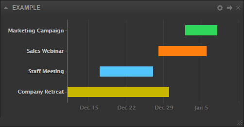
Gantt
This chart is used to display project timelines over a time span.
Data Format
Each row is a comma separated list of values. You can display multiple projects in a single widget.
Labels: Required. In the first row of your data, you must specify what labels you would like to use for your projects.
Data: Required. Starting from the second row, append a list of projects along with their start and end dates in YYYYMMDD format.
Colors: Optional. You can use your own color scheme for your projects by appending hexadecimal color codes to the end of your list. The first value in this row must always be “Color”.
Example
| Event | Start Date | End Date |
| Marketing Campaign | 20150102 | 20150108 |
| Sales Webinar | 20141228 | 20150106 |
| Staff Meeting | 20141217 | 20141227 |
| Company Retreat | 20141110 | 20141230 |
Merge Tags
You can add the {date_start} and {date_end} merge tags directly to your query (e.g. SELECT full_name FROM users WHERE registered>='{date_start}’ AND registered<‘{date_end}’). The merge tags will be automatically replaced by the respective dates in YYYYMMDD format when your query is executed based on the selected time period in your dashboard. You can also use the {group_by} merge tag which will be replaced by the values “day”, “week”, or “month”. You can use these tags to generate dynamic content that respects the dashboard date range feature.
Get Started
To get started, simply sign up or log in to your existing account and click the Add Widget button found at the top of your screen.