We’re always adding new services to our widget collection. But we understand that your data could be locked up in many places such as your PC or workstation, your company’s internal databases and other third party applications.
Let’s say you want to see a real-time report of how many people signed up on your site or app. Or maybe your boss wants you to put together a marketing status report on a daily basis. No problem! Using custom widgets, you can hook your dashboards up to almost any data source on the web. Or pull data straight from CSV files.
If you prefer, you can also pull data from your databases using our SQL Widget or push data in using the Push API.
How It Works
Step 1. Decide on what type of custom widget you would like to use with your data. See the list of available custom widget types below.
Step 2. Create a CSV file with the data you want to see in your custom widget. Make sure your data format matches the data format of the custom widget type you selected in step 1 (data formats found below). You can also dynamically create the CSV file using Google Spreadsheets or your favorite programming language such as PHP or ASP and host it on your website.
Step 3. Configure a new custom widget inside your dashboard and either pull the CSV file straight from a private URL or off of your PC. You can also pull data from Google Spreadsheets. If pulling from a private URL, you can specify how often you want us to refresh the data (e.g. every 10 secs, 5 mins, 24 hours).
Custom Widget Types
As of today, the following custom widget types are available for you to feed data into.
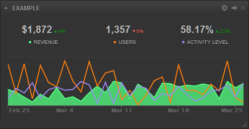
Line, Spline, Area, Area-Spline, Stacked Area, Column, Stacked Column, Stacked Percentage Column, Bar, Stacked Bar
These charts are used to show trends and performance over a period of time.
Data Format
Each row is a comma separated list of values. You can group as many metrics together as you like into a single widget.
Labels: Required. In the first row of your data, you must specify what labels you would like to use for your metrics. You can also specify the type of value your labels will represent (i.e. dollar amount, percentage, time) by appending “($)”, “(%)”, or “(:)” at the end of the label. The first value in this row must always be “Date” if you would like to take advantage of historical data features like data archival and date range selections.
Data: Required. Starting from the second row, append a list of values for your metrics starting with the date (YYYYMMDD) as the first value in each row.
Colors: Optional. You can use your own color scheme for your metrics by appending a row of hexadecimal color codes to the end of your list. The first value in this row must always be “Color”.
Types: Optional. You can specify the type of chart you want to see for each individual metric by appending a row of chart types to the end of your list. The first value in this row must always be “Type”. By default all metrics will use the chart type selected in the widget configuration screen.
Cumulative: Optional. Use this row to indicate whether you would like to see cumulate values for particlar metrics in the widget header. The first value in this row must always be “Cumulative”. Use the values “0” or “1” to indicate which metric to cumulate values for (e.g. “Cumulative,1,0,0,0”).
Average: Optional. Use this row to indicate whether to display averages for particular metrics in the widget header. The first value in this row must always be “Average”. Use the values “0” or “1” to indicate which metric to average (e.g. “Average,1,0,0,0”).
Total: Optional. If you use “Date” as the first column label in your data, by default the widget will automatically calculate the averages for percentage based metrics or the sums for all other metrics based on the current time period and display them in the widget header. This row enables you to overwrite these values in the widget header. The first value in this row must always be “Total” (e.g. “Total,542,23,42,49”).
Comparison: Optional. If you use “Date” as the first column label in your data, by default the widget will automatically calculate percent changes for each metric by comparing the current time period against the last based on the current time period and display it in the widget header. This row enables you to overwrite these values in the widget header. The first value in this row must always be “Comparison” (e.g. “Comparison,-10,50,42,0”).
Reverse: Optional. Use this row to indicate whether high values are good or bad for particlar metrics (e.g. high “unlikes” count on Facebook is bad). This row is used to caclulate percent differences (comparisons) in the widget header. The first value in this row must always be “Reverse”. Use the values “0” or “1” to indicate which metric to reverse (e.g. “Reverse,1,0,0,0”).
ReverseGraph: Optional. Use this row to indicate whether you want to display a graph upside down (e.g. when displaying ranking information). The first value in this row must always be “ReverseGraph”. Use the values “0” or “1” to indicate which metric to reverse the graph for (e.g. “ReverseGraph,1,0,0,0”).
YAxis: Optional. By default each metric you add to the widget falls on its own y-axis. This row enables you to use a single y-axis across all your metrics in the widget thereby syncing the data. The first value in this row must always be “YAxis”. Use the value “0” for all metrics to sync them (e.g. “YAxis,0,0,0,0”).
YAxisMin: Optional. The minimum value of the y-axis. By default this value is “0” for each metric. The first value in this row must always be “YAxisMin” (e.g. “YAxisMin,0,20,100,0”).
YAxisMax: Optional. The maximum value of the y-axis. By default this value is automatically calculated for each metric. The first value in this row must always be “YAxisMax” (e.g. “YAxisMax,1000,2000,500,600”).
YAxisShow: Optional. By default all y-axes are hidden. This row enables you to turn on the y-axis for a particlar metric. The first value in this row must always be “YAxisShow”. Use the values “0” or “1” to indicate which metric’s y-axis to show (e.g. “YAxisShow,1,0,0,0”).
LabelShow: Optional. By default all data labels are hidden. This row enables you to turn on the data labels for a particlar metric. The first value in this row must always be “LabelShow”. Use the values “0” or “1” to indicate which metric’s data labels to show (e.g. “LabelShow,1,0,0,0”).
Date,Revenue($),Users,Activity Level(%)
20170117,29,82,10
20170118,87,38,82
20170119,30,63,48
20170120,70,65,41
20170121,12,52,14
20170122,78,41,36
20170123,10,23,51
20170124,71,24,86
Color,#52ff7f,#ff7e0e,#9d8cf9
Type,area,line,line
Pie, Donut
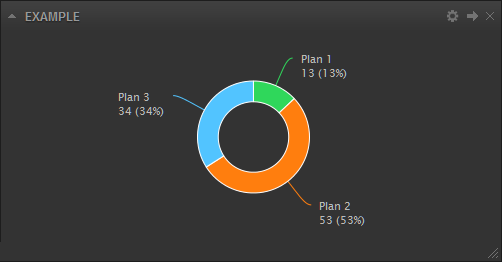
These charts are used to show the breakdown of data into its constituents, i.e. parts of a whole.
Data Format
Each row is a comma separated list of values. You can only display 1 metric in a single widget.
Labels: Required. In the first row of your data, you must specify what labels you would like to use for your metrics. You can also specify the type of value your labels will represent (i.e. dollar amount, percentage, time) by appending “($)”, “(%)”, or “(:)” at the end of the label.
Data: Required. In the second row, append a list of values for your metric.
Colors: Optional. You can use your own color scheme for your metric values by appending a row of hexadecimal color codes to the end of your list. The first value in this row must always be “Color”.
Example
Plan 1,Plan 2,Plan 3, Plan 4, Plan 5
3,2,4,64,343
Color,#ff7f00,#00cb13,#ee0000,#009dee,#dc00d9
List
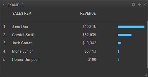
This chart is used to display information in list format.
Data Format
Each row is a comma separated list of values. You can only display 1 metric in a single widget.
Labels: Required. In the first row of your data, you must specify what labels you would like to use for your metrics. You can also specify the type of value your labels will represent (i.e. dollar amount, percentage, time) by appending “($)”, “(%)”, or “(:)” at the end of the label.
Data: Required. Starting from the second row, append a list of values for your metric.
Colors: Optional. You can use your own color scheme for your metric values by appending a row of hexadecimal color codes to the end of your list. The first value in this row must always be “Color”.
Example
Sales Rep,Revenue($)
Jane Doe,100132
Crystal Smith,52035
Jack Carter,10342
Mona Junior,5413
Homer Simpson,100
Color,#ff7f00
Funnel
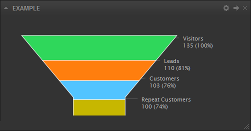
This chart is used to display information in a funnel.
Data Format
Each row is a comma separated list of values. You can only display 1 metric in a single widget.
Labels: Required. In the first row of your data, you must specify what labels you would like to use for your metrics. You can also specify the type of value your labels will represent (i.e. dollar amount, percentage, time) by appending “($)”, “(%)”, or “(:)” at the end of the label.
Data: Required. Starting from the second row, append a list of values for your metric.
Example
Type,Count
Visitors,15654
Leads,4064
Customers,1987
Repeat Customers,976
Table
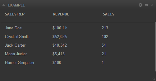
This chart is used to display information in table format.
Data Format
Each row is a comma separated list of values. You can group as many metrics together as you like into a single widget.
Labels: Required. In the first row of your data, you must specify what labels you would like to use for your metrics. You can also specify the type of value your labels will represent (i.e. dollar amount, percentage, time) by appending “($)”, “(%)”, or “(:)” at the end of the label.
Data: Required. Starting from the second row, append a list of values for your metric.
Example
Sales Rep,Revenue($),Sales
Jane Doe,100132,213
Crystal Smith,52035,102
Jack Carter,10342,54
Mona Junior,5413,21
Homer Simpson,100,1
Gauge
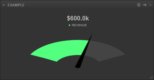
This chart is used to display information in a gauge.
Data Format
Each row is a comma separated list of values. You can only display 1 metric in a single widget.
Labels: Required. In the first row of your data, you must specify what label you would like to use for your metric. You can also specify the type of value your label will represent (i.e. dollar amount, percentage, time) by appending “($)”, “(%)”, or “(:)” at the end of the label.
Data: Required. In the second row, append the current and target values for your metric.
Colors: Optional. You can use your own color scheme for your metric by appending a hexadecimal color code to the end of your list. The first value in this row must always be “Color”.
LabelShow: Optional. By default the target data label is hidden. This row enables you to turn it on for your metric. The first value in this row must always be “LabelShow”. Use the values “0” or “1” to indicate whether to show the target data label (e.g. “LabelShow,1”).
Example
Revenue($),Target
600000,1000000
Number
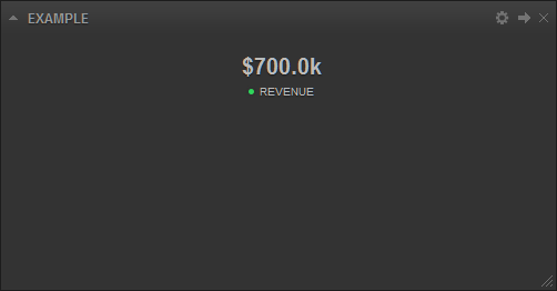
This chart is used to display information as a simple number.
Data Format
Each row is a comma separated list of values. You can group as many metrics together as you like into a single widget.
Labels: Required. In the first row of your data, you must specify what label you would like to use for your metric. You can also specify the type of value your label will represent (i.e. dollar amount, percentage, time) by appending “($)”, “(%)”, or “(:)” at the end of the label.
Data: Required. In the second row, append the value you want to display for your metric.
Colors: Optional. You can use your own color scheme for your metric by appending a hexadecimal color code to the end of your list. The first value in this row must always be “Color”.
Example
Revenue($)
700000
Cohort
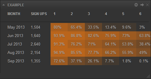
This chart is used to display behaviors of a group of subjects over a time span (e.g. customer retention rates).
Data Format
Each row is a comma separated list of values. You can only display 1 metric in a single widget.
Labels: Required. In the first row of your data, you must specify what labels you would like to use for your metric.
Data: Required. Starting from the second row, append a list of values for your metric.
Colors: Optional. You can use your own color scheme for your metric by appending a hexadecimal color code to the end of your list. The first value in this row must always be “Color”.
Example
Month,Sign Ups,1,2,3,4,5,6
May 2017,1504,1203,984,504,201,145,45M
Jun 2017,1640,1540,1423,1354,1245,1198,1046
Jul 2017,2640,2410,2012,1874,1693,1420,1013
Aug 2017,2154,2045,1842,1674,1425,1204,1055
Sep 2017,1355,984,503,354,104,24,1
Color,#c96a18
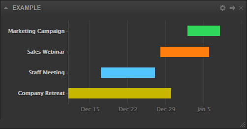
Gantt
This chart is used to display project timelines over a time span.
Data Format
Each row is a comma separated list of values. You can display multiple projects in a single widget.
Labels: Required. In the first row of your data, you must specify what labels you would like to use for your projects.
Data: Required. Starting from the second row, append a list of projects along with their start and end dates in YYYYMMDD format.
Colors: Optional. You can use your own color scheme for your projects by appending hexadecimal color codes to the end of your list. The first value in this row must always be “Color”.
Example
Event,Start Date,End Date
Marketing Campaign,20150102,20150108
Sales Webinar,20141228,20150106
Staff Meeting,20141217,20141227
Company Retreat,20141110,20141230
Image
This widget allows you to brand your dashboard with any image on your PC or workstation. Simply upload the image using the widget configuration screen.
IFrame
This widget allows you to pull custom web pages from a private URL. It can be used to display things like custom status messages from your internal systems or to embed entire web pages into your dashboard (e.g. slideshows).
Merge Tags
For custom Private URL and IFrame widgets, you can add the {date_start} and {date_end} merge tags to your URL (e.g. http://www.yourdomain.com/script?start_date={date_start}&end_date={date_end}). The merge tags will be automatically replaced by the respective dates in YYYYMMDD format when your URL is loaded. You can also use the {group_by} merge tag which will be replaced by the values “day”, “week”, or “month”. You can use these tags to generate dynamic content that respects the dashboard date range feature.
